Designing Nonprofit Landing Pages for Every Step of the Visitor Journey
When someone clicks on your nonprofit’s ad, they are beginning a journey. From that first spark of interest to the final click of a "Donate" button, your landing page is the bridge that turns attention into action.
However, too many nonprofits spend weeks perfecting their ad copy only to send that traffic to a generic homepage. This breaks the journey. To maximize your impact, you need to structure your landing page design around the visitor’s experience, guiding them smoothly from curiosity to commitment.
In this post, we’ll break down the five stages of a visitor’s experience and share strategies for optimizing each step.
Stage 1: The Click — Aligning Expectations
The journey begins the moment a user clicks your ad. Whether they found you via a Google Ad Grant search or a visually striking Instagram ad, the page they land on must align perfectly with the expectations set by your initial message. In digital marketing, we call this "Message Match."
Think of it from a consumer perspective. Imagine you are shopping for shoes online. You see an ad for a 50% off sneaker sale from a favorite retailer. You click the ad, excited to browse—but you are taken to a page showcasing cookware.
That is a massive disconnect. You are likely frustrated enough to leave immediately.
Your mission is more critical than selling shoes, so you must ensure your supporter doesn't feel that same disconnect. Here is your checklist for the arrival:
Match the Headline: Your landing page headline should mirror the ad copy. If your ad read, "Double Your Impact This Holiday Season," your landing page headline shouldn't just say "Welcome to Our Nonprofit." It should scream, "Your Holiday Gift is Matched Today."
Use Consistent Visuals: The internet is full of dubious links. Reduce a visitor's natural suspicion by using the same imagery, fonts, and color palettes in your ad and your landing page. This visual continuity builds subconscious trust.
Confirm the Promise Quickly: Don’t make them hunt. If the ad promised a story about a rescued puppy named Luna, Luna’s face should be the first thing they see.
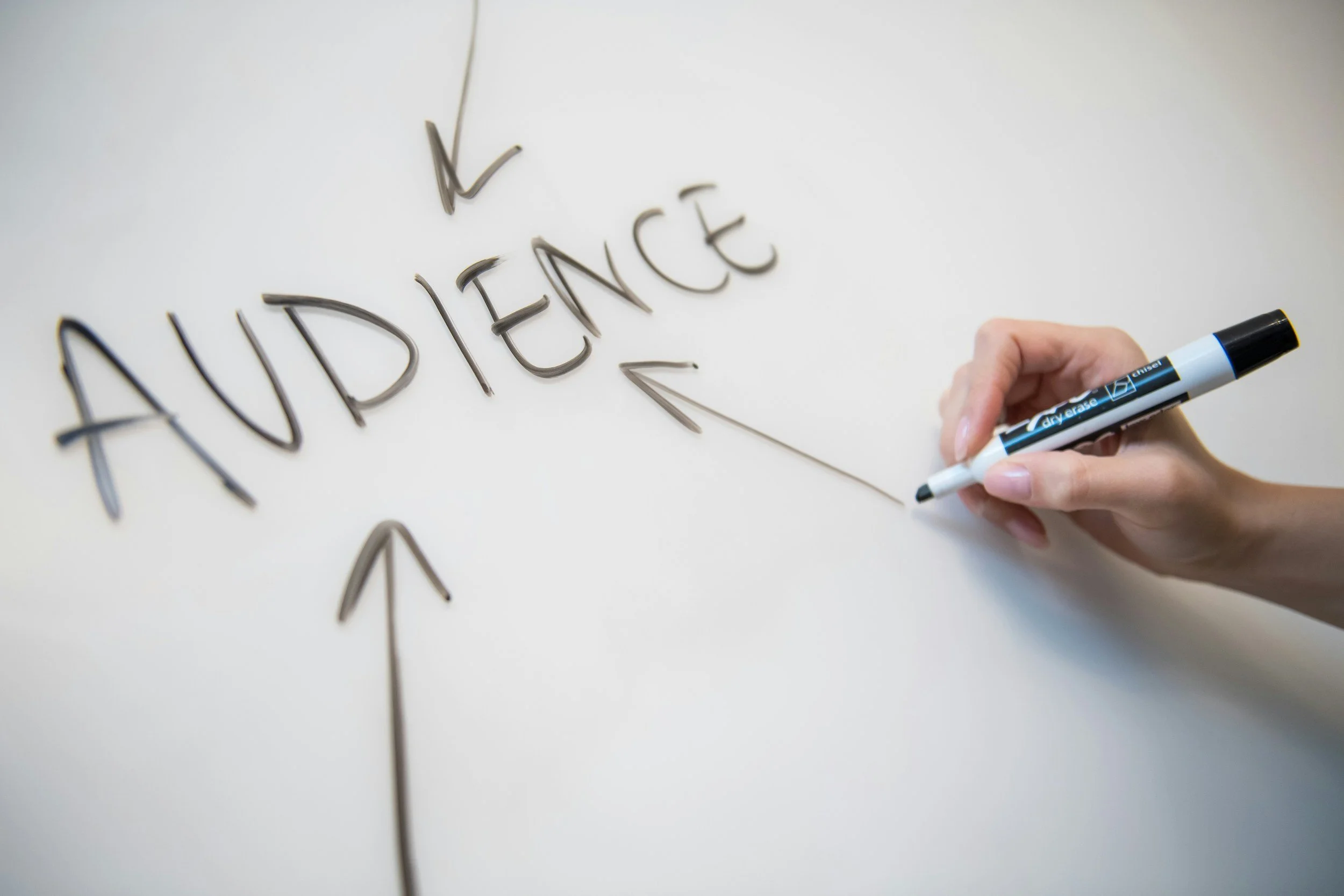
Stage 2: The Scan — Capturing Interest
Once they trust they are in the right place, visitors will perform "The Blink Test." In about 3 to 5 seconds, they will scan your page to decide if it is worth their time. They aren't reading yet; they are skimming.
This is your moment to capture attention and communicate value before they bounce.
Lead with Impact: Don't bury the lede. Focus immediately on what their action will accomplish. Instead of "Our History," lead with specific impact like "Provide 50 Meals to Families in Need."
Show & Tell: Facts explain, but stories sell. Use emotional storytelling to hook the reader. While data is important, lead with a narrative—a specific person, animal, or community that benefits from your work. When you link data to a human face, it becomes harder to look away.
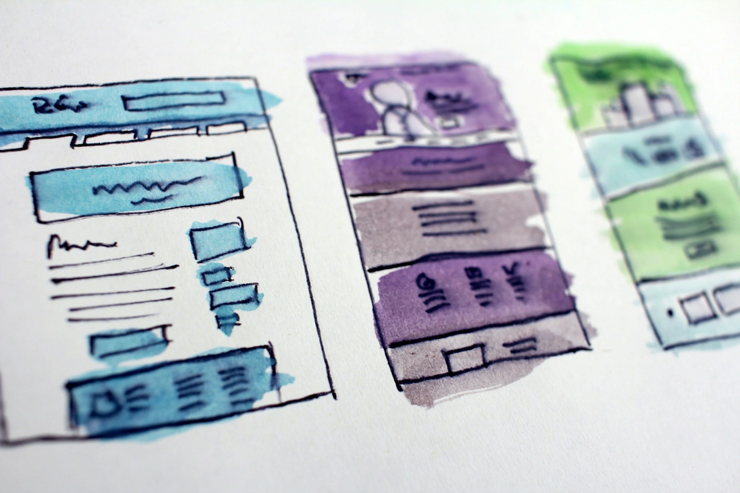
Make it Punchy: Avoid the "Wall of Text." Large blocks of text are daunting, especially on mobile screens. Use short paragraphs, bold subheadlines, and bullet points to make the content digestible.
Stage 3: The Consideration — Inspiring Action
If they are still reading, you have hooked them. Now they are moving from "interest" to "consideration." This is where they decide if they are going to act. Your goal here is to remove friction and answer the question: "Why should I do this now?"
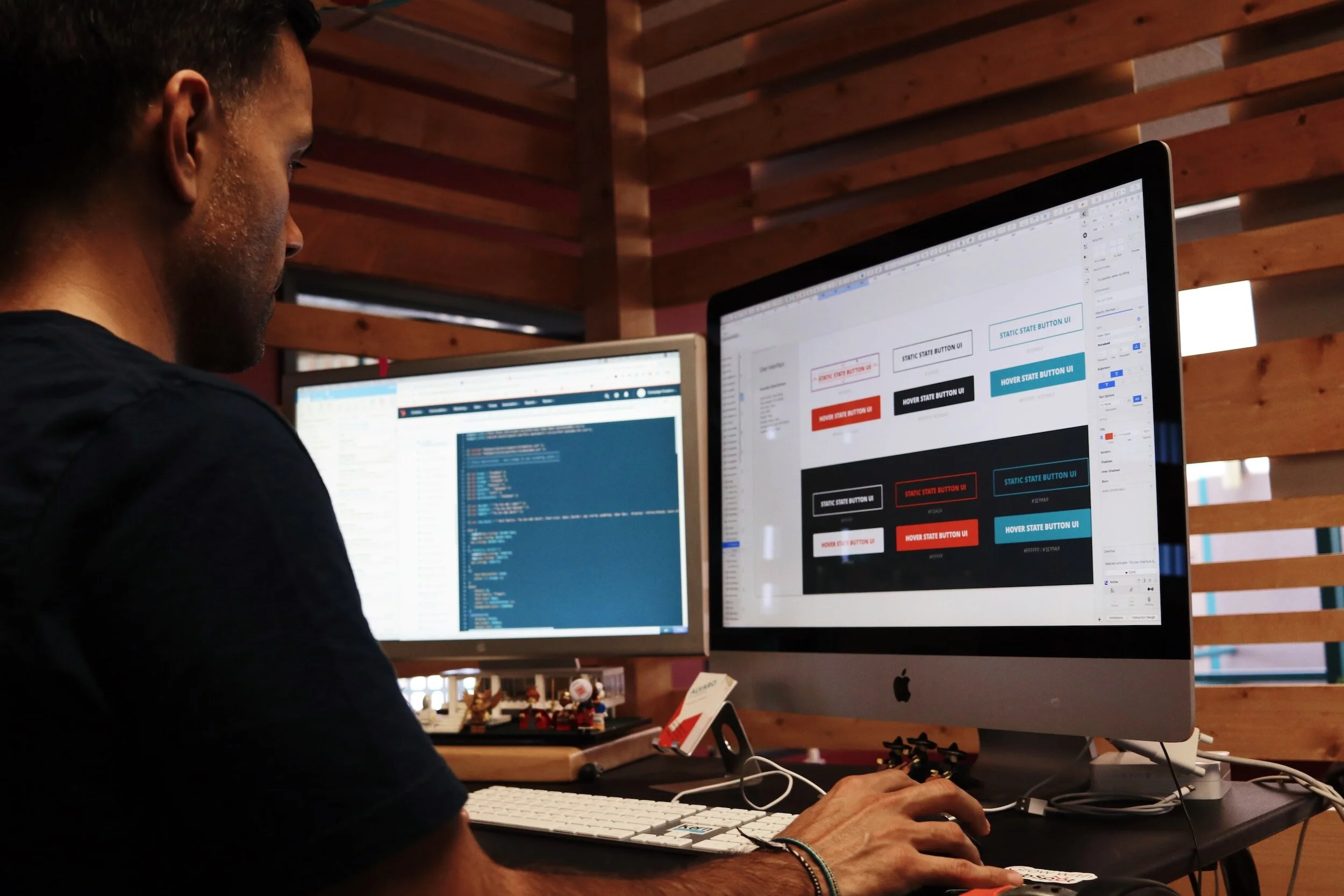
Make Your Call-to-Action (CTA) Pop: Your button shouldn't blend in. Use a contrasting color that stands out from the rest of the page. And be specific—instead of a generic "Submit," use action-oriented text like "Donate $25 Now" or "Join the Fight."
Leverage Social Proof: Hesitation is natural. Counter it by showing that others trust you. Display a message or testimonial from a donor, a badge from Candid/GuideStar, or a simple counter showing "500 people have signed this petition."
Keep the Focus: At this stage, distractions are your enemy. Avoid cluttering the page with sidebars, unrelated blog posts, or links to other programs. Keep their eyes on the prize.
Stage 4: The Decision — Completing the Conversion
The visitor is ready to act. They have clicked "Donate." Now, they are in the checkout phase. This is the most fragile part of the journey; you want to ensure you don't lose them due to technical frustration.
The "Squeeze" Technique: On your specific donation or campaign sign-up page, consider removing your website’s main navigation menu. You don't want a donor to get halfway through the form, see a "News" tab, click it, and never come back. Give them only two choices: complete the action or close the tab.
Reduce Form Friction: Only ask for what you absolutely need. Do you really need their phone number? Do you need their middle initial? Every extra field you add decreases your conversion rate. Keep it short.
Highlight Security: Especially for donations, trust is paramount. Ensure your form is SSL (HTTPS), and display recognizable security badges (like Stripe, PayPal, or Norton) near the credit card field. Even easier, use a reputable payment processor or embeddable fundraising software that takes care of all of this for you.
Stage 5: The Follow-Through — Nurturing the Relationship
The journey doesn’t end when they click "Submit." A thoughtful follow-through transforms a one-time transaction into a long-term relationship.
The Thank-You Page: Don't just show a generic receipt. Use this page to deepen the connection. Show a video of your team saying thank you, or ask for a small, secondary action, like following your nonprofit on Instagram.
Immediate Email Confirmation: Ensure your automated email receipt is warm, personalized, and reinforces the impact of their gift. This is often the specific email with the highest open rate you will ever send—don't waste it.
Retargeting: For those who visited but didn't convert, the journey isn't necessarily over. Use retargeting ads to gently remind them of the impact they could have made, perhaps addressing common hesitations.
Key Takeaways
Designing landing pages isn't just about making things look pretty; it's about psychology and user experience. By respecting the five stages of the visitor journey, you can turn more clicks into meaningful impact.
Align Expectation: Ensure your "Message Match" between ad and page is tight.
Capture Interest: Use benefits and stories, not just features and stats.
Inspire Action: Make your CTA clear, urgent, and descriptive.
Facilitate the Decision: Remove navigation links and reduce form fields to lower friction.
Nurture the Follow-Through: Use your Thank You page to start the next chapter of the story.
When your landing pages guide the natural flow of a visitor’s experience, your digital campaigns stop being just a cost and start becoming an engine for growth.