Intuitive Nonprofit Web Design & Its Impact On Your Google Ad Grant
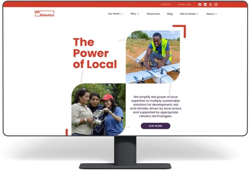
Today, competition for clicks is intense, and nonprofits face the unique challenge of converting interest into action. Google Ad Grants provide a powerful tool for nonprofits to increase their visibility and drive engagement, like email sign-ups, event registrations, and donations. However, the success of your campaigns greatly depends on how well-designed your website is and how strategically you manage your ad campaigns. After reading Making nonprofit websites intuitive: the "Don't Make Me Think" principle by MOD Lab, it sparked some inspiration in us to not only share those great tips (seriously, go read the full article) but underscore how good web design can impact your paid media efforts—especially Google Ad Grant accounts.
Intuitive Website Design is Foundational
The first goal of a Google Ad Grant account is to help potential or existing supporters find your website. Imagine you're out for a stroll, and you crave a cup of coffee. You spot what appears to be a coffee shop ahead and proceed towards it. As you reach for the door handle, you discover it's locked and must look for another entrance to the shop (404 IRL). After some searching, you find another entrance and enter the shop. You expect to see a counter with a barista and coffee-making equipment; instead, you're confronted with signs pointing in various directions to coffee-related items, a section of the cafe dedicated to the history of coffee, and find yourself navigating a maze of signs and displays before you finally reach the counter.
Not a great experience. You might get frustrated trying to find the counter, and it could leave you wanting a simpler coffee-buying experience. This hyperbolic example is how a website visitor feels when they click on a link from Google Search and are met with a confusing maelstrom of menus, links, and other items that litter our websites.
So make it easy on everyone:
Keep It Simple: Once someone clicks on your ad and lands on your website, make their next steps easy while browsing your site. Clear, intuitive design means having a simple navigation menu, minimal design elements (which often also make the site load faster and more accessible), and clear calls to action on each page. The easier your website is to explore, the more likely visitors will take action, such as subscribing to a newsletter or donating.
That also goes for page layout, too. We can’t say it any better than MOD Lab: “A clutter-free and organized layout lets visitors focus. Sections, headers, shape, and space create a map of what you have to share. They help someone scan the page.”
Consistency Is Key: Your nonprofit's website should reflect your mission and branding. Consistency in using colors, fonts, program names, and messaging helps with brand recognition and assures users that they're in the right place. You’ll extend this same consistency to your ads, which makes the experience on your website from first click to last a more seamless experience.
Optimized Landing Pages: Whether visitors arrive at your website through an ad or social media, your primary goal is to convert their interest into action. To achieve that, design your landing pages with a clear focus, content that supports the focus, and relevant calls to action. While having a persistent 'Donate' button in your header is okay, avoid making every page focus on fundraising. Instead, create a detailed program page with a sign-up link for your monthly newsletter so visitors can stay informed about your programmatic updates. You can also include a link to your 'Upcoming Events' page where they can learn about the next opportunity to join a webinar or see your work in action. Optimizing your landing pages can significantly increase your conversion rates and help you maximize your Google Ad Grant.
This brings us to the ultimate point: Make your sign-up and donation processes seamless. Don't stand in their way when someone is ready to subscribe to your newsletter or open their wallet for your cause. The process should be simple and easy to complete and reinforce the trust you’re building with them—including by sending them a follow-up ‘Thank you’ email that looks and feels like the website they just visited and the experience they just enjoyed.
MOD Lab suggests a similar check-list for your donation and email sign-up processes:
Is the form too lengthy and difficult to complete? Only ask for the information that you actually need and plan to use—like for personalization or segmentation.
Can you ask for additional information after the donation transaction is complete?
Do you provide fast and secure payment options like Apple Pay, Google Pay, and Venmo? If you use a modern payment processing platform, these are often included or available to activate.
Is the form designed in a visually appealing way that reflects your brand?
Does the form live on your website, or will it take them off to a third-party page to complete the transaction?
Amplifying Impact: Strategic Ad Grant Management
Nonprofits often use unique names to refer to their programs or areas of focus. For instance, an organization that works on farming and agriculture may have a programmatic focus on "productive yields." When discussing your work, it's important to consider how others would look for information about it, such as through search engines. Having relevant terms for common searches on your ads and website can benefit you. To illustrate, between "farming and agriculture" and "productive yields," which do you think has more search volume? Tools like Google Trends can help you compare.
This is not to say that you should base all your programs around Google Search or Ads. Rather, it’s to suggest that how you talk about your work should be clear and accessible to a lay audience—at least if you want their support.
So, as you populate your website with relevant content to your work, consider the following:
Keywords & Search Terms: Your website and ads aim to reach the right audience with the right message at the right time. Understand the terms your audience uses by researching your keywords, and craft your page and ads to speak directly to their needs and interests. For your ads, use specific, long-tail keywords to capture highly targeted traffic and refine your campaigns based on performance data.
Ad Copy That Resonates: Your ad copy is often the first interaction potential supporters have with your nonprofit. Make it count by being clear, compelling, and directly related to the action you want users to take. When your potential supporter clicks a link, your landing page should fulfill the promise of the ad copy, highlighting the impact of your community’s support and what makes your nonprofit unique. A/B testing different ad variations can help identify what resonates best with your audience.
It's important to remember the power of simplicity and strategic focus. Your website should be easy to navigate, ensuring a smooth user journey from the moment they click on your ad to taking the desired action. At the same time, managing your Google Ad Grant with precision and strategic insight will help attract and engage the right audience.
For nonprofit communications and fundraising professionals, understanding this symbiotic relationship is crucial to making the most of digital tools. Creating an intuitive, user-friendly website and strategically managing your Google Ad Grants can increase your impact, drive engagement, and support your organization's mission.
⏭️ What’s Next? Make sure that your Google Ad Grant is set up for success. Check out our FREE guide!


